
Defining Your Brand with Gianni Calfa
Defining Your Brand
I bet you can’t guess what we’ll have you reference as we start to explore your brand. You guessed it– your business goals. Maybe we should take a minute and pause so you can frame them and put them right above your work station.
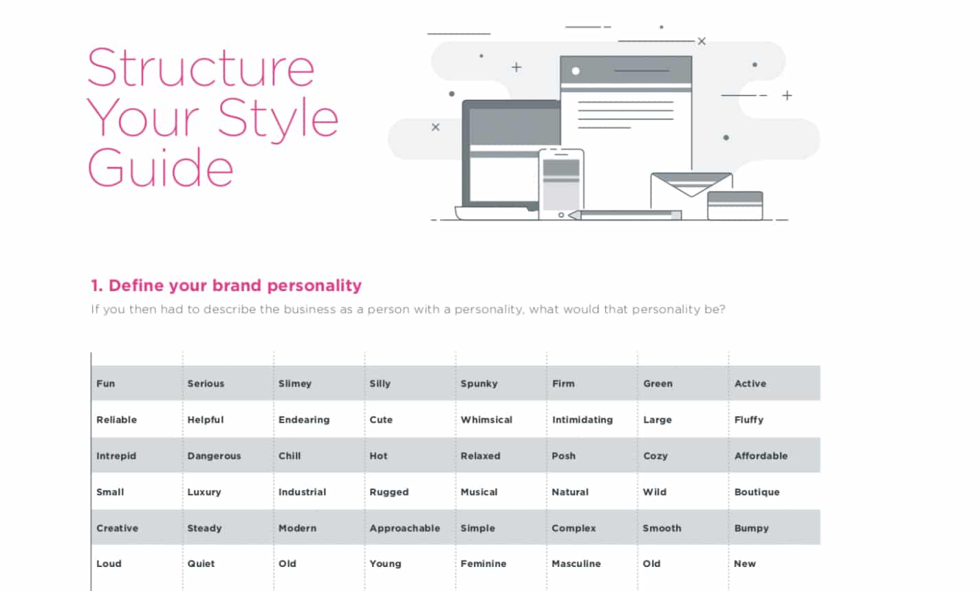
Given your business goals, your industry, and… well, you (as the business owner you ARE the business for the first while), how would you describe the personality of the business? Check out the list of descriptive words in the style guide template below. Those examples may help you define your business’ personality.
Hopefully you also gained some inspiration from this list that helped you find just the right words. With your list, narrow it down to 3 adjectives you would want others to use when describing your business. This slight shift in perspective from how you would describe your business to how your customers would describe it may help you land on the right nuance. For example, you can do this within a relationship. My husband and I did this recently, and as a result he changed one of his words from “loyal” to “devoted.” You can see how they have a shared meaning, but how they also differ slightly.
Identifying your brand first is important because we want it to reflect you. Now, you can move on to critically examine the way your competitors are communicating their personality within their brand. You’ll most likely find similarities within an industry. Whether it be color schemes, shapes, words, etc. Take these as data points, information for how the market is communicating with their ideal buyer. Are there things you want to incorporate? What about your business personality will help you stand out?
Consider filling out a matrix like the following:
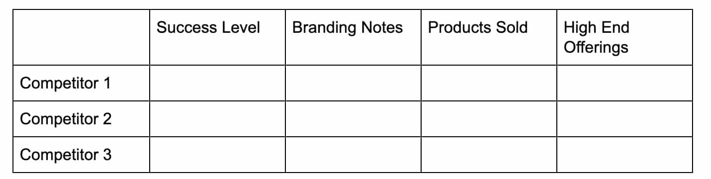
Success Level: This is your subjective opinion about their success combined with any objective data you have/can find on their business performance (social media followers, annual revenue, annual sales, market share, market penetration, etc.– you may have some of this from the earlier steps in the process).
Branding Notes: write down colors, feelings, organization, images, etc.
Products sold: What are they? How does the packaging look? Is their brand communicated in the names of their products?
With these notes, you can see commonalities (what may be industry wide) and differentiations. Take some. Leave some. Most importantly, remain authentic to your brand and your mission. It will be communicated through your branding, and potential buyers will pick up on those visual queues faster than almost anything else.
Style Guide Template
Creating a style guide will do three big things for you.
- Provide a structure of uniformity and consistency
- Allow you to be proactive instead of reactive
- Make you identifiable as a professional institution
The style guide will have you create rules for your:
- Logo
- Photos & Illustrations
- Typeface
- Colors
Logo
How can you make something that represents that personality you established before?Look for inspiration. Iterate. Iterate. Iterate. Follow the rule of 3 and develop 3 distinct options. Get feedback on those options and take the version that is most liked, and iterate on that 3 times.
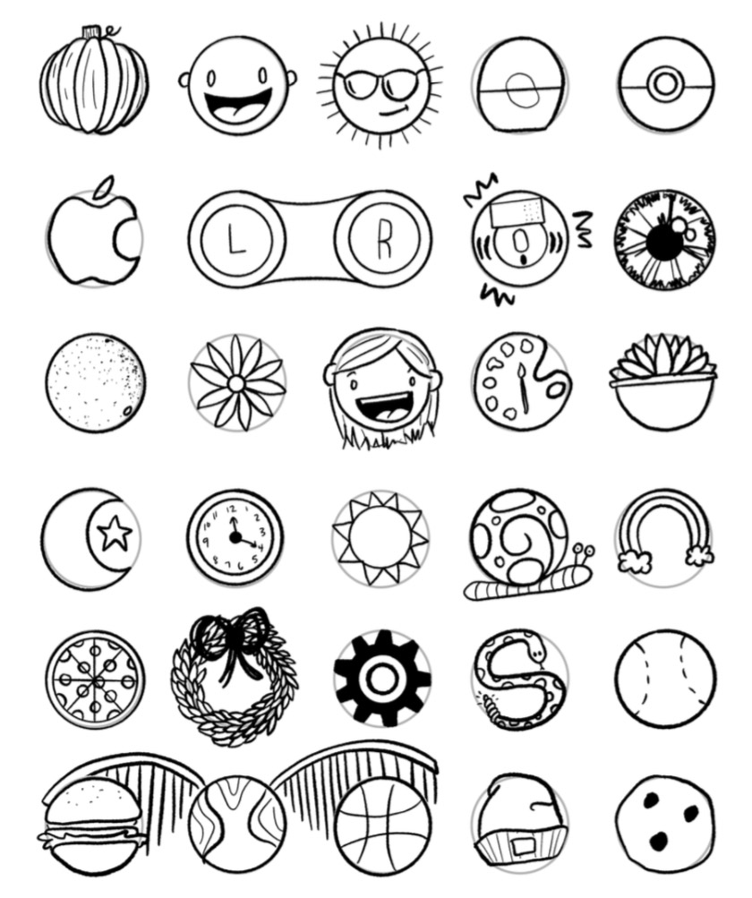
If you need help getting creative, try this 30 CIRCLES EXERCISE.² Utilized by the dschool at Stanford, this exercise gives you a constraint (the circle; and a timer if you choose to add that) that will actually help you unlock your creativity.
One of our designers decided to take advantage of downtime between meetings and did this with her 30 circles. Notice how she chose to follow or break the constraint of the circle.
The cardinal rule when it comes to logos is to keep it simple and make it recognizable. Always start with black and white. It has to work in black and white. It has to be strong in black and white. And it has to scale well. Think of the smallest it may ever be (business card, embroidery on a shirt, on your website, etc.) and the largest if may ever be (billboard, building signage, etc.). Does it work well at both extremes?
Now we can start to play around with your logo. Think of placement, variations, stacking, etc.
Tools and resources for logo design:
99 Designs
Canva
Photography & Illustration
Think of when you will use photos/images/graphics and the rules you’ll want to follow. Do you have 10 images you rotate through? Will they all have the same filter applied? What are the dimensions? How will the photos play with other imagery?
If you need help finding images to incorporate into your style guide, check out the following:
Unsplash
Pexels
iStock
Shutterstock
Typeface(s)
Out of everything we’ve discussed so far, this has the potential to be the most overwhelming. There are SO many options out there. And for those of us that don’t have a design eye, it can be difficult to spot the differences. So don’t fret too much.
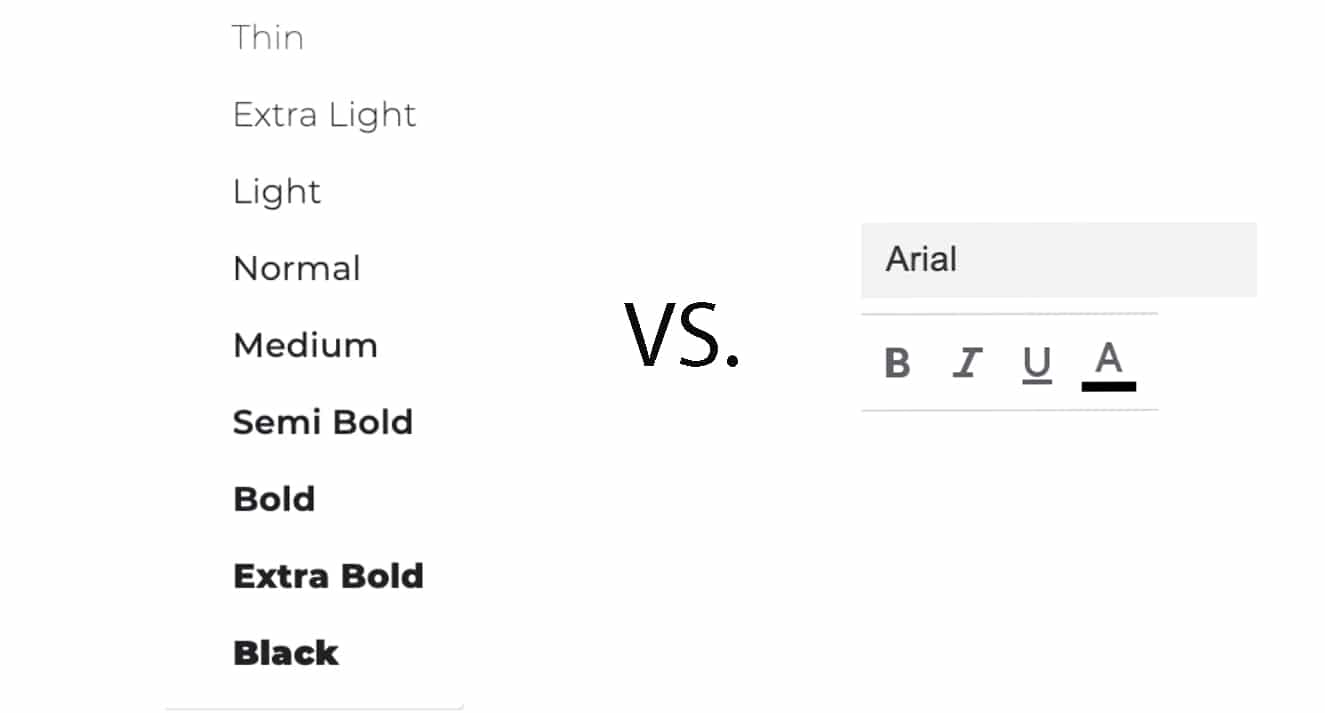
You may want to revisit some of the brands you examined earlier. One quick thing you can assess is whether they are using a font that has serifs or is sans serifs. From there, explore fonts that have a large family. A font that has different weights can help provide variety. With the large variety, you can also have room to have fonts serve as negative space (i.e. white text on a colored background). And there’s no requirement to use all of the options. We want the left over the right (see below).
To find a font, try visiting Fontsinuse.com.¹
Colors
Go back to your brand personality and your competitor assessment. Are there color families you want to stay within? Do you want to break out of the norm? Whatever you choose, we highly recommend you stick to 2 main colors (maybe 3) and 1-2 secondary colors. Limiting your colors will help you maintain the level of consistency we’re striving for. It will also ensure that your brand remains recognizable, even from afar.
When you land on your colors make sure to right down all of the variations of color identifications (HEX codes, RGB, etc). The last thing you want is to forget or lose these. However, there are tools out there that can help you identify your colors if you lose that information.
With all of those items created, you can now take your design and create a few templates. Here are a few things you might want to mock up:
Digital
Instagram images (square)– also works for Facebook
Linkedin images (rectangular)– you can stick with a square if you’d like, but rectangles Banner– can be used in ads, email, or as footers on your website
YouTube banner– if you use this channel, you’ll want something at the beginning and/or end of your videos to identify your brand
Email templates
Email signature
Physical
Collateral
Letterhead
Business cards
Table of contents
Get the best of Weave, right in your inbox.


Ready to grow your practice?
See firsthand how Weave can help you grow your practice.